
Begin with the wall, not the artwork
Choosing large wall art can start with a short measurement brief rather than a style shortlist. Record the usable wall area, the width of the furniture below it, and the intended placement. Those observations give you a way to compare a single oversized composition, a multi-panel arrangement, or a personalized piece against the room’s actual boundaries.
Two proportions provide a starting check. One design guide suggests using artwork that fills about 60–75% of the usable wall space. For art above furniture, a design guide suggests a width of approximately two-thirds to three-fourths of the furniture’s width. Treat both ranges as starting points, not universal requirements; the wall’s open space and the arrangement’s visual weight still matter.
Then note the room’s existing colors, lines, textures, and subjects. Neutral or muted large-scale art can complement a tonal interior, while a bold oversized piece can set the room’s color direction. Consider a ready-made or personalized piece only after the layout, style relationship, and desired degree of personal meaning are clear.
Use the measurements to run a layout test before judging the artwork itself.
- Compare the planned art width with the furniture width when the piece will hang above it. The two-thirds-to-three-fourths range is a reference point, not a pass/fail rule.
- Compare the planned footprint with the usable wall area. The 60–75% suggestion can help identify a piece that is too small or too dominant, but it is not a universal requirement.
- Assign the wall a placement: above a sofa, opposite the entry, or alone on a bare feature wall. A single oversized composition can serve as the room’s central visual element and, in some designs, replace a gallery wall.
- Compare the arrangement’s visual weight with the room. Large-format options include abstracts, panoramic landscapes, figurative work, and photography. Neutral or muted palettes can complement tonal interiors, while bold pieces can set the room’s color direction.
- If the concept depends on a personal subject or specific meaning, record that requirement alongside the physical measurements rather than leaving it implicit.
The resulting wall-first brief records the wall measurements, furniture width, intended placement, proportion references, chosen format, palette, subject, and desired degree of personalization.
Personal taste still has the final say. Use that flexibility to choose with care rather than treating the first attractive print as a permanent answer.
Measure the wall and furniture separately
Wall dimensions and furniture dimensions answer different questions, so measure both before choosing large art. The wall measurement tells you how much of the vertical or horizontal surface the arrangement can occupy. The furniture measurement tells you whether the artwork will relate convincingly to the object beneath it.
Start by recording:
- The wall’s full width and height.
- Any area blocked by doors, windows, vents, shelving, or adjacent architectural features.
- The width and height of the sofa, console, or other furniture below the art.
- The clear area where the artwork can sit without colliding visually with nearby objects.
- The orientation that suits the wall: horizontal, vertical, square, or divided into panels.
Call the unobstructed area the usable wall. That distinction keeps a large blank wall from misleading you into choosing a format that overwhelms the actual display area.
A design guide suggests using artwork that fills about 60–75% of the usable wall space. Treat that range as a starting point, not a universal requirement. A wall with a nearby doorway, a strong architectural feature, or substantial furniture may need a different visual proportion even when its total dimensions appear generous.
For art above furniture, the same guide suggests a width of approximately two-thirds to three-fourths of the furniture’s width. This furniture check is separate from the usable-wall check. A composition can occupy a reasonable share of the wall while still being too narrow for the sofa below it, or it can relate to the sofa while leaving the surrounding wall visually unbalanced.
Use both checks together:
- Wall check: Does the art occupy a considered share of the available surface?
- Furniture check: Does its width relate to the sofa or console beneath it?
- Clearance check: Does the arrangement leave enough surrounding space to read as intentional?
- Orientation check: Does the shape use the wall’s proportions rather than fighting them?
These checks narrow the field. They do not dictate a single size.
A practical paper test can help you judge proportion before you buy. Mark the proposed outer dimensions with painter’s tape or paper, then view the outline from the places where you normally sit and enter the room. Compare the outline with the sofa, lighting, shelving, and nearby openings. If the marked area feels isolated, cramped, or visually weak, revise the format before comparing artwork subjects.
The test is especially useful when you are choosing between a single wide piece and a group of smaller works. Measure the full outer footprint of the group, including the gaps between panels, rather than measuring each panel alone. The wall responds to the complete arrangement.
Choose the arrangement that fits the wall’s role
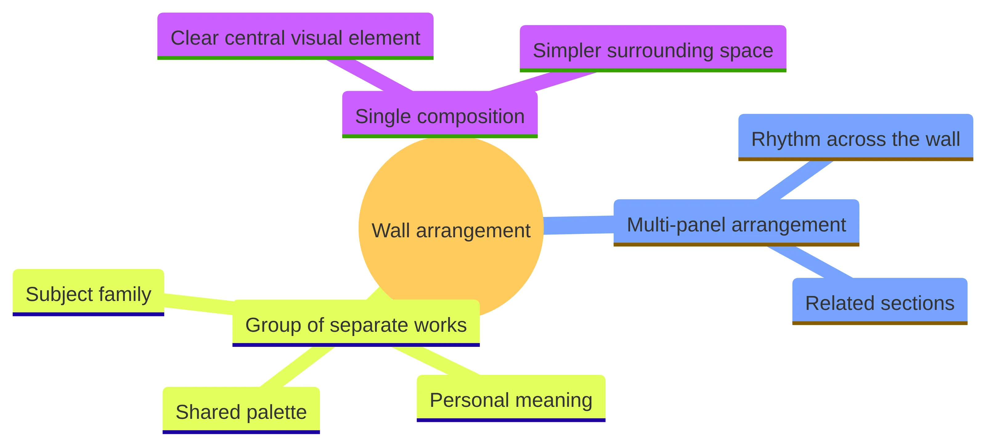
The wall’s role should determine whether you choose a single composition, a multi-panel arrangement, or a group of individually meaningful works. A large wall is not automatically asking for more objects. It may need a clear visual anchor, a sequence that follows the wall’s width, or an arrangement that leaves room for several subjects to speak together.
Use the single-piece route when:
- The wall needs a clear central visual element.
- The room already contains several patterns, objects, or competing focal points.
- The artwork’s subject can carry the space without needing a supporting group.
- You prefer a decisive composition and simpler surrounding space.
A single oversized composition can serve as the room’s central visual element and, in some designs, replace a gallery wall. Judge the complete piece, including its frame or border, as the visual unit.
Use a multi-panel arrangement when the wall is wide, the room benefits from rhythm across its surface, or the subject gains meaning when it is divided into related sections. A modern multi-panel print or a simple botanical arrangement can suit a bohemian room when the colors connect with the existing furnishings and the design remains uncomplicated.
Panel count is less useful than total footprint and relationship. A listed botanical set, for example, uses three 16-by-24-inch panels; those dimensions belong to that particular listing, not to multi-panel art as a general format. Measure the outer width and height of the finished arrangement, including the spaces between panels, before deciding whether it fits.
Use a group of separate works when the arrangement itself carries the personal meaning. This route can hold several related subjects, changing proportions, or pieces collected over time. It also gives you more flexibility to move or replace individual works as your preferences change.
The trade-off is visual coordination. A group needs a shared reason to belong together, such as a related palette, subject family, line quality, or frame treatment. Without that link, the wall may feel like a collection of isolated choices rather than a planned composition. Choose the arrangement that gives the wall a clear job, then compare artwork within that format.
Place the visual anchor deliberately
Placement determines where the artwork enters the room’s visual conversation. Large pieces are commonly considered above a sofa, on the wall opposite the entry, or alone on a bare feature wall. Each location asks you to judge the artwork from a different set of sightlines.
Above a sofa, compare the artwork with the sofa’s width, back height, arms, cushions, and surrounding side tables. The arrangement should relate to the furniture without appearing to continue its horizontal line mechanically. A broad composition may echo the sofa’s width, while a vertical work can introduce a different rhythm if the wall and surrounding objects support it.
On the wall opposite the entry, consider what the artwork will do at first glance and from the room’s main seating positions. A bold piece can establish the room’s color direction; a neutral or muted piece can sit within a tonal interior with less visual competition. Neither route is automatically preferable. Choose according to the attention you want the wall to receive.
A bare feature wall can support a single statement when the surrounding space gives it enough room to read clearly. Clean space matters more as the format becomes larger because nearby objects can interrupt the composition’s edges and reduce its visual authority.
Before you settle on placement, stand in the room’s ordinary viewing positions and ask:
- Does the artwork meet your eye naturally from the sofa?
- Is its main subject blocked by a lamp, plant, shelf, or doorway?
- Does the arrangement compete with the television or another focal point?
- Does the wall still feel balanced when you view it from the entry?
- Does the surrounding space help the artwork read as a complete unit?
If the answer changes from one viewing position to another, decide which sightline matters most for the room’s everyday use. A placement that looks strong in a product photograph may not work from your actual seating position.
The visual anchor is the element that receives the clearest attention, not necessarily the largest object in the room. Compare the artwork with rugs, curtains, lighting, shelving, and architectural details before assigning it that role. If the room already has a strong anchor, choose art that supports the composition rather than forcing a second focal point into the same sightline.
Compare subjects and styles by room fit
Subject and style should be judged against the living room’s existing visual language. Large-format options include abstracts, panoramic landscapes, figurative work, and photography. The choice changes the room’s emphasis because a large subject occupies more attention than a small accent print.
Begin with the room rather than a category label. Record the qualities already present:
- Straight or curved lines.
- Quiet or contrasting colors.
- Repeated natural motifs or geometric forms.
- Dense layering or generous open space.
- Formal, casual, traditional, contemporary, or mixed furnishings.
- A preference for recognizable scenes or less literal imagery.
Then ask what the artwork should add. It might repeat a shape that already appears in the room, introduce a color that is present only in small accents, or provide a calmer counterpoint to patterned furniture. The choice should have a reason beyond the fact that the image looks attractive by itself.
For a modern living room, compare abstracts, geometric prints, minimalist line art, and contemporary photography. These options can support clean lines and deliberate simplicity, while a single large piece offers a clear alternative to several small works. Test the actual image against the room’s furniture and accessories rather than assuming that a style label settles the decision.
For a bohemian room, a modern multi-panel print or minimalist botanical print can work when it picks up colors already present and keeps the composition simple. Artwork that repeats every color in the room may become busy; artwork that ignores the room entirely may feel disconnected. Choose a limited visual link and let the artwork retain its own identity.
Palette is a structural choice at large scale. Neutral or muted art can complement a tonal interior, while a bold oversized piece can set the room’s color direction. Decide whether you want the art to blend with the current palette or establish a stronger direction that other accents can support.
Use a simple color test:
- List the room’s three most visible colors.
- Mark which colors the artwork repeats, softens, or introduces.
- Decide whether the new color will remain confined to the artwork or appear elsewhere in the room.
- View the palette in daylight and in the room’s usual evening lighting.
- Reject any option whose color relationship works only in isolation.
This test does not promise a particular atmosphere or appearance. It gives you a concrete way to compare visual compatibility.
Choose realism, interpretation, or expressive texture
The difference between a photograph and a painting is not limited to medium. Each asks you to choose how literally the living room should show a place, subject, or moment. Photography suits a preference for realism, precision, and a specific captured moment. Painting suits a preference for interpretation, emotional expression, and visible texture.
Choose photography when your brief emphasizes:
- A recognizable place or precise visual moment.
- Clear detail and a close relationship to what was captured.
- A subject that should remain visually literal.
- A presentation that supports the room without changing the subject’s interpretation.
Choose painting when your brief emphasizes:
- A personal interpretation of a place, object, or mood.
- Expressive marks or texture as part of the visual experience.
- A less literal connection to the reference subject.
- An image that can carry feeling without documenting a specific moment.
Neither route is a general answer for every living room. Your brief should identify whether recognition or interpretation matters more.
Watercolor abstract art can be considered when the desired image needs to express different moods of the subject and the creator. That makes the medium relevant when you have a clear emotional or visual direction but do not need a literal rendering of a scene.
Describe the direction in ordinary terms rather than relying on a style name alone. You might specify a quiet botanical subject, loose color movement, a restrained palette, or a more expressive treatment of a familiar place. The more clearly you can describe the intended relationship between subject and mood, the easier it becomes to compare a ready-made work with a custom concept.
Use this decision sentence: Choose the format that preserves the quality you want to notice every day. If you want to recognize a particular view, begin with realism. If you want the artwork to interpret a subject through feeling and texture, begin with painting. If both matter, compare how much literal detail the room can carry without competing with its other visual elements.
Test visual weight alongside physical size
Physical dimensions tell you how much wall an artwork occupies, but visual weight tells you how strongly it speaks inside that space. Two works with the same outer measurements can feel very different because of contrast, subject density, color saturation, framing, and the amount of open space in the composition.
A bold oversized piece can set the room’s color direction, while neutral or muted large-scale art can sit more quietly within a tonal interior. Use that distinction to test the room’s balance. A dark, high-contrast image may need more visual breathing room than a pale, open composition of the same size. A detailed subject may compete with patterned upholstery even when its colors coordinate.
Compare visual weight with this checklist:
- Contrast: Does the artwork have a strong light-dark difference against the wall and furniture?
- Color intensity: Are its colors muted, moderate, or highly saturated compared with the room?
- Subject density: Does the image contain a few clear forms or many competing details?
- Open space: Does the composition leave visual pauses, or does it fill the entire surface with activity?
- Frame presence: Does the border add a distinct line, color, or material layer?
- Nearby competition: Will shelves, patterns, lighting, or a television share the same attention?
Use the answers to decide whether a large format needs a quieter image or whether the room can support a stronger statement. This is a comparison tool, not a prediction of how the artwork will change the room.
The distance test helps separate size from weight. View the proposed artwork from close range, from the sofa, and from the entry. At close range, inspect detail and texture. From the sofa, judge whether the subject remains legible without becoming distracting. From the entry, judge whether the composition reads as a coherent shape.
If an artwork feels too forceful from every position, reduce contrast, saturation, subject density, or outer size. If it disappears from the main seating position, look for stronger tonal separation or a larger visual footprint before abandoning the concept. Compare like with like: assess complete framed or panel arrangements, not isolated image files.
Decide what personalization needs to accomplish
Before comparing personalized options, identify the specific meaning the artwork should carry. Write down whether that meaning involves a place, a family connection, a meaningful subject, a particular memory, or a visual mood that a ready-made option may not capture.
Ask yourself:
- Does the artwork need to show a specific place or object?
- Should the subject be recognizable to you and your household?
- Is the personal meaning private, obvious, or shared with visitors?
- Does the room need a subtle reference or a dominant story?
- Would personalization belong in the image, the palette, the arrangement, or the accompanying text?
- Will the concept still suit the room after the immediate occasion has passed?
These questions keep personalization connected to the wall rather than treating it as an extra feature.
A custom-print route may let you choose a style, upload photos, and personalize the design. Shutterfly describes options that include photos or collages, several materials, framed or frameless presentation, text and layout changes, color adjustments, and flexible sizing. These examples show the kinds of controls some services offer; they do not establish that every provider offers the same choices.
Use a photo-based route when the reference image itself carries the meaning. Use a collage or text-supported route when several memories need to appear together. Use a more interpretive commissioned image when the personal idea matters but a literal photo would not suit the room’s visual language. Compare the route by the meaning it can preserve, not by the number of available controls.
Personalization can also be quiet. A subject, palette, or arrangement may express your household without displaying names, dates, or a recognizable portrait. If the room already contains several personal objects, a restrained artwork may carry the connection more comfortably than another highly specific image. Choose the degree of personal detail that supports the room’s role and the way you want to live with it.
Consider custom watercolor when the concept is specific
Custom watercolor becomes worth considering when you can describe the subject, visual direction, and personal meaning but cannot find a ready-made work that brings them together. The value of the route is not a guaranteed result; it is the ability to begin from a more specific concept.
We also believe personalized watercolor illustrations can create a deeper emotional connection and suit occasions such as housewarmings. Those are our stated areas of practice and perspective, not a promise about what every commission will accomplish.
A custom route may fit your brief when:
- The artwork must show a particular place, object, or personal reference.
- You want interpretation rather than a direct photographic reproduction.
- The room needs a subject or palette that ready-made options have not matched.
- You can explain the intended mood without asking for an undefined image.
- The artwork’s personal meaning will remain relevant beyond a single event.
If you cannot yet describe the subject or the room’s requirements, continue comparing existing options first. A commission needs a usable brief.
Watercolor abstract art can depict different moods of the subject and the creator. Watercolor blooms can also serve as living-room focal points, including a large framed print above a sofa or a gallery wall featuring peony pieces. These are useful directions when your concept depends on expressive interpretation, botanical subject matter, or a focal image that remains connected to the room.
Translate the idea into specific choices:
- Subject: Name the flower, landscape, architecture, object, or combination you want represented.
- Reference: Identify the photograph, place, memory, or visual cue that carries the idea.
- Mood: Describe whether the work should feel restrained, lively, quiet, airy, or expressive without promising a result.
- Palette: List colors already present in the room and colors you are willing to introduce.
- Format: State whether the work belongs above the sofa, on a bare wall, or within a larger group.
- Degree of interpretation: Explain whether the subject should remain recognizable or become more abstract.
A specific brief gives you something to compare before you inquire. It also makes it easier to decide whether a custom watercolor is solving a real gap or simply adding another option.
Our watercolor illustration practice is a fit to consider when the brief calls for a personally meaningful image interpreted through watercolor. Keep the decision tied to your room: the subject still needs an appropriate scale, placement, palette, and visual weight. A personal concept does not remove the physical checks.
Build a shortlist from three viable directions
A three-direction shortlist keeps comparison practical without forcing every possibility into the same category. Build each direction as a complete room proposal rather than collecting unrelated images. Each proposal should identify its arrangement, subject, style, palette, visual weight, and personalization level.
Use these three starting directions:
- Single statement: A single oversized composition acts as the central visual element on the chosen wall. Compare an abstract, panoramic landscape, figurative work, or dramatic photograph according to the room’s existing language.
- Coordinated arrangement: A multi-panel or grouped format spreads related visual information across the wall. Keep the total footprint, panel spacing, and shared palette visible in the comparison.
- Personal interpretation: A custom or personalized image begins from a specific subject, reference, or household connection and is shaped to the room’s format.
These directions are not rankings. They are different ways to solve the same wall problem.
Create a comparison sheet with the same fields for all three directions:
| Criterion | Single statement | Coordinated arrangement | Personal interpretation |
|---|---|---|---|
| Wall role | Central anchor | Rhythm across the wall | Meaningful focal image or group |
| Subject | Existing large-format subject | Related subjects or panels | Specific place, object, or memory |
| Style | Abstract, landscape, figurative, or photographic | Shared style across the set | Watercolor, photo-based, or interpreted treatment |
| Palette | Quiet or room-defining | Repeated colors across panels | Room-compatible custom direction |
| Personal detail | Low to moderate | Moderate through subject grouping | Deliberate and specific |
| Main question | Can this composition carry the wall? | Does the complete group feel coherent? | Is the concept clear enough to brief? |
For photography versus painting, compare whether realism and a captured moment matter more than interpretation, emotional expression, and texture. For personalization, compare whether a service or artist can support the controls or concept your brief requires. Keep each criterion tied to the room rather than to a general preference.
Keep a direction only if it passes the wall, furniture, placement, and room-fit checks. A direction that succeeds on personal meaning but fails the available footprint is not ready. A direction that fits the wall but has no reason to belong in the room should also leave the shortlist.
After the first comparison, choose the two directions that deserve closer inspection. Keep the third as a boundary case only if it reveals a useful contrast, such as literal photography versus interpreted watercolor or a single composition versus a divided arrangement.
Remove options that pass only one test
A strong option needs to pass several tests at once. Remove artwork that looks attractive in isolation but fails the wall proportion, furniture relationship, placement, palette, subject, or personal-meaning check. This is where a broad shortlist becomes a decision.
Run each option through the following gates:
- Footprint gate: Does the complete artwork or arrangement occupy a considered share of the usable wall?
- Furniture gate: If the piece sits above furniture, does its width relate to that furniture rather than appearing stranded or cramped?
- Placement gate: Does the proposed location give the artwork a clear sightline and a suitable role?
- Style gate: Does the subject and treatment connect with the room’s lines, colors, and existing decor?
- Weight gate: Does contrast, density, and saturation suit the attention the wall can carry?
- Meaning gate: Does the artwork express something you actually want to live with?
- Practical gate: Can you confirm the format, presentation, and provider-specific terms before committing?
The wall-space range of about 60–75% and the furniture-width range of approximately two-thirds to three-fourths are starting points from design guidance, not automatic pass-fail laws. Use the measurements to expose a mismatch, then consider the room’s exceptions.
Remove a single statement when its visual weight competes with an existing focal point or when the composition needs more surrounding space than the wall can provide. Remove a multi-panel route when the full arrangement becomes crowded or lacks a shared visual link. Remove a personalized route when the subject is not clear enough to describe or when the personal detail would make the artwork difficult to live with beyond the original occasion.
A clear boundary is useful: do not keep an option merely because it solves a single attractive problem. Keep it only when the complete room case remains convincing.
When two options pass the physical checks, use the room’s desired visual language as the tie-breaker. Choose the photograph when realism and a specific captured moment carry the concept. Choose the painting when interpretation, emotional expression, or texture carries it. If neither distinction resolves the choice, return to subject and personal meaning rather than adding more shopping categories.
Prepare a measured selection brief
A measured selection brief turns your room into information you can use while comparing artwork or speaking with an artist. Keep it short enough to consult and specific enough to prevent a vague choice.
Include these fields:
- Wall location: Above the sofa, opposite the entry, or on a bare feature wall.
- Usable wall dimensions: The clear width and height available for the complete display.
- Furniture dimensions: The width and height of the sofa, console, or other object below the art.
- Preferred format: Single composition, multi-panel arrangement, grouped works, or personalized image.
- Placement view: The main seating position, entry view, and any sightline that matters most.
- Room language: Existing lines, colors, textures, subjects, and competing focal points.
- Visual weight: Quiet, moderate, or assertive, with notes about contrast and detail.
- Subject: The scene, object, botanical reference, architecture, or abstract direction.
- Personal meaning: What the artwork should represent and how visible that connection should be.
- Open questions: Format, presentation, customization, approval steps, and other details you still need to resolve.
This brief does not guarantee a visual result. It gives you a consistent basis for comparing alternatives.
Use this fill-in structure:
Wall location:
Usable wall width and height:
Furniture width and height:
Approximate wall-share starting point:
Approximate furniture-width starting point:
Preferred arrangement:
Main viewing positions:
Existing room colors and lines:
Desired visual weight:
Subject or reference:
Personal meaning:
Questions to resolve before committing:
The wall-share and furniture-width fields keep the two proportion checks separate. The viewing-position field keeps placement practical. The subject, palette, and meaning fields keep the choice from collapsing into generic decor.
Use the brief to compare listings, saved images, or a custom concept without changing your criteria for each option. Wall art can be moved or replaced as your preferences change, so the brief does not need to predict every future decision. It only needs to describe the room and the choice in front of you clearly enough to support a deliberate shortlist.
Verify vendor-specific details before committing
Before you commit to a listed product or service, check:
- The complete dimensions of the finished artwork or arrangement.
- Whether listed dimensions describe the image, panel, frame, or total display.
- The available orientation and whether it suits your wall.
- The presentation choices, including framed, frameless, or multi-panel treatment where offered.
- The image or file requirements for a personalized design.
- The customization controls that apply to your chosen format, not merely to the service generally.
- The current price, availability, and terms shown by the provider.
- The process for reviewing or approving a personalized design, if applicable.
A product listing may give dimensions or other specifications for that listing alone. Another listing reported a Premium Canvas Print up to 40-by-60 and a Luxe Wall option up to 30-by-40. Those examples are not universal format rules, and product prices and specifications can change. Check the provider’s current details before purchase.
Do not finalize an option while a material detail remains unclear. If the provider has not established the exact finished size, presentation, personalization controls, or current terms for your chosen format, treat that item as unresolved and continue with a comparable option or a direct question. The room decision comes first, but the commitment should wait until the selected format is clear.
Start with a measured brief for your room
Large living-room art becomes easier to choose when you separate the decisions that are often blurred together. Measure the usable wall and furniture independently, choose the arrangement according to the wall’s role, compare subject and style with the existing room, test visual weight alongside physical size, and decide what personalization needs to accomplish.
A single oversized composition, a coordinated group, and a custom watercolor can all be reasonable directions. The suitable route is the one that passes the physical, visual, and personal checks together. Write those checks down before you compare the final options.
If your choice involves an individual design or commission, a qualified professional should decide whether the specific arrangement and artwork are suitable for your circumstances.
What should you prepare before choosing or commissioning large living-room wall art?
What should I consider when measuring my wall for large artwork?
Measure the wall’s full width and height, accounting for any obstructions like doors or windows. Identify the usable wall space to determine how much area is available for the artwork.
How do I determine the appropriate size for wall art in relation to my furniture?
As a general guideline, artwork above furniture should be approximately two-thirds to three-fourths the width of the furniture piece. This helps ensure the artwork relates well to the furniture below it.
What types of artwork are suitable for a modern living room?
For modern living rooms, consider abstract art, geometric prints, minimalist line art, or contemporary photography. Large-scale single pieces often make stronger statements than multiple smaller works.
When is it appropriate to choose custom watercolor artwork?
Custom watercolor is worth considering when you have a specific subject or personal meaning that ready-made options do not fulfill.
How can I personalize my wall art selection?
Personalization can involve selecting a specific subject, color palette, or arrangement that reflects your household’s personality. Consider what meaning the artwork should convey and how it fits within the room’s decor.
What are some practical tips for arranging large wall art?
Consider the wall’s role and the artwork’s placement. Large pieces often work well above sofas or as standalone statements on bare walls. Ensure there is enough surrounding space for the artwork to be visually effective.
What factors should I evaluate when comparing different artwork styles?
Assess how each style complements the existing decor, including color, lines, and overall ambiance. The artwork should enhance the room’s visual language rather than clash with it.


comments +