
Turn an unfinished idea into an artwork decision
Choosing artwork for a room becomes easier when you define the job before you choose a picture, pattern, format, or artist. Start with two questions: what should the piece express, and how should it relate to the room around it? Those answers give you a direction to test instead of leaving you to choose from an endless range of subjects and styles.
Your direction can be personal, visual, practical, or a combination of all three. You may want a landscape connected to a place you love, a botanical subject that supports the room’s atmosphere, a bold graphic element, or a pattern that connects several surfaces. Choosing artwork is personal, and the style and personality you want your home to express belong at the center of the decision.
A room-and-person brief is the simplest way to turn that idea into a decision. Write down:
- The room and the wall, furniture, or surface involved.
- The mood or personality you want the artwork to express.
- The subject, motif, or story you want to see.
- The colors already present and the colors you may want to introduce.
- The approximate scale and placement available.
- Whether you want a finished piece to select or a direction created around your home.
Use the brief to decide whether existing artwork gives you enough fit or whether a personalized route is worth exploring. You do not need a perfect concept at the start. You need enough clarity to compare choices without letting a passing trend make the decision for you.
Name what the artwork should express
The meaning you want the artwork to carry should come before the product format. A room can express calm, affection for a place, interest in nature, energy, restraint, playfulness, or a shared household identity. Choose the feeling and subject you want to live with first; decide whether that becomes a painting, print, illustration, or pattern afterward.
Personal taste does not have to be perfectly consistent across your home. Different household members may prefer different subjects or visual languages, and a personal gallery can combine those tastes rather than forcing every piece into one style. That gives you permission to look for a relationship between the pieces instead of demanding an exact match.
A short expression exercise can reveal what you are actually looking for:
- Write three words that describe the room you want to create.
- Write three subjects, places, or motifs that carry personal meaning.
- Circle the words and subjects you would still want to see after the current trend has passed.
- Separate the qualities you want from the features you merely happen to like in a particular example.
For example, you might discover that you want a room to feel connected to water, but that the exact choice between a lake scene, abstract blue forms, or a repeating wave pattern is still open. That distinction is useful. It preserves the personal reason for the artwork while leaving room to choose a form that suits the wall.
Shared rooms benefit from a shared decision rule rather than a forced compromise. Ask each person to name a subject, color, or visual quality they want represented, then look for overlap. The overlap might be a common palette, a shared love of landscapes, or a balance between quiet and graphic pieces. If no single piece can carry every preference, let the room hold more than one kind of artwork and connect the choices through placement, color, or scale.
The practical action is simple: write the personal meaning in one sentence before you browse. If you cannot explain why the subject belongs in your home, keep exploring the brief instead of choosing only because the image is attractive.
Use the room as a compatibility check
The room is the first compatibility check for any artwork direction. Look at the wall, nearby furniture, textiles, lighting, and objects that will remain in place. The artwork does not need to copy those elements, but it should have a clear relationship with them through color, visual weight, subject, or contrast.
Color is a practical starting point. Choosing artwork that picks up colors already present in the room can help connect its colors and styles while maintaining visual balance. Make a short palette note before you choose: list two or three colors that must remain visible, one color you would welcome as an accent, and any color that would make the piece feel out of place.
Scale deserves the same attention as color. Measure the available wall or surface, then record the furniture or architectural features around it. Include the space above a sofa, bed, console, desk, or other anchor if the artwork will relate to one of those objects. You are not trying to calculate a universal correct size. You are creating a boundary that prevents a piece from being judged in isolation.
Use these checks:
- Photograph the wall from the position where you usually see it.
- Record the available width and height, including nearby doors, windows, shelves, and switches.
- Note whether the artwork will stand alone, sit beside other pieces, or form part of a larger arrangement.
- Mark the distance from the artwork to the furniture or surface below it.
- Decide whether the piece should hold attention from across the room or reward closer viewing.
A large wall may call for a strong visual presence, while a narrow area may need a quieter shape or a smaller focal point. Those are selection conditions, not promises about what will look right. Use the actual room photograph and measurements to test the direction before you commit.
The final room check is movement. Look at the artwork direction from the doorway, from the main seating position, and from the point where you enter the room. Ask whether the subject remains legible at the distance that matters and whether the colors compete with something you want to keep prominent.
The direct action is to save one room photograph, one palette note, and one measurement note with your brief. Any artwork you consider should be assessed against those three references rather than against a blank product image.
Decide whether the piece is a focal story or a surface language
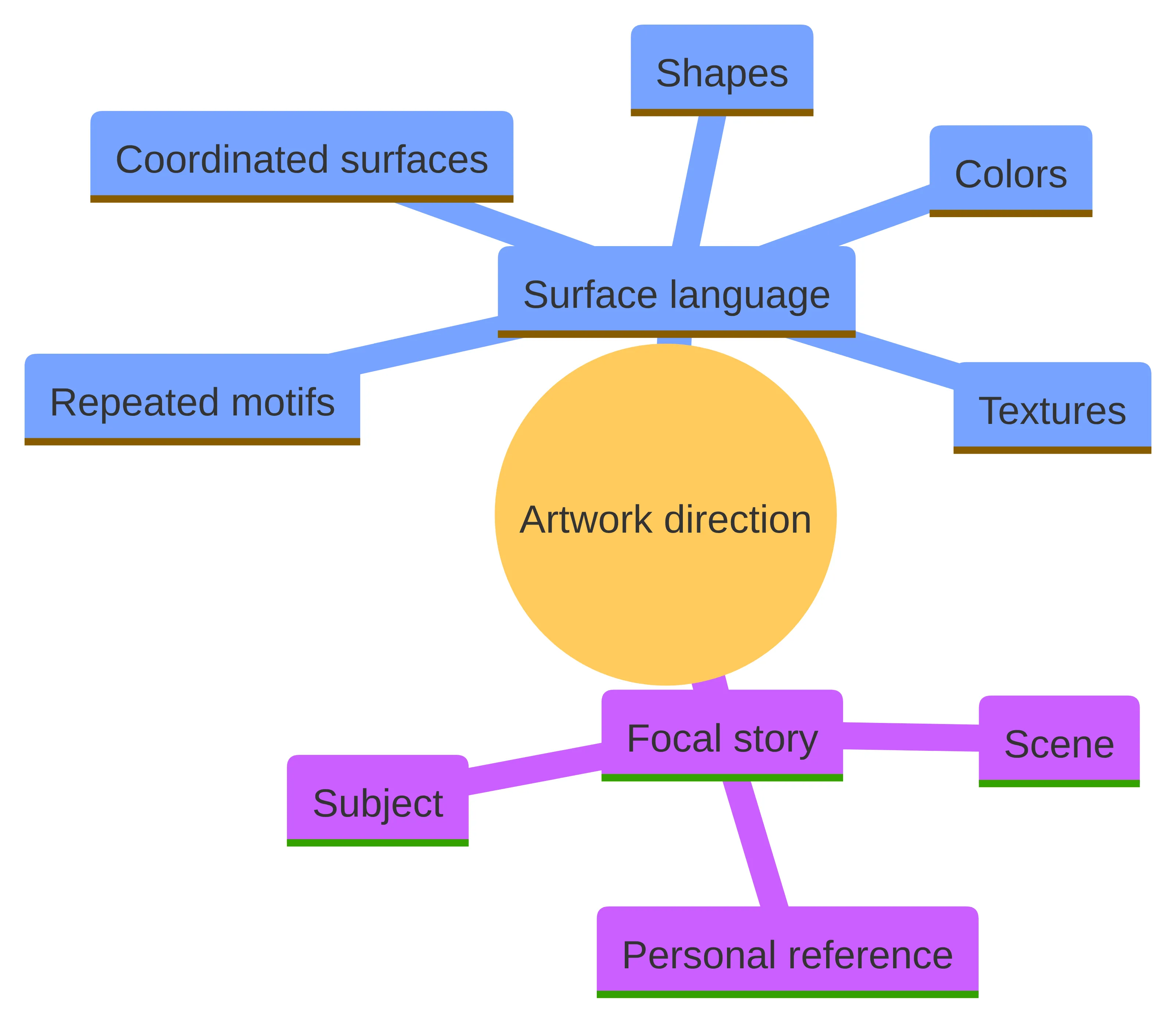
The artwork’s visual job usually falls into one of two directions: a focal story or a surface language. A focal story asks you to look at one subject, scene, or composition. A surface language uses repeated motifs, shapes, colors, or textures to create continuity across a surface or group of surfaces.
Surface pattern design creates decorative designs, patterns, and textures for surfaces such as fabric, wallpaper, ceramics, and wall décor. Surface patterns can be printed onto surfaces such as fabric, paper, and ceramics. That makes pattern a useful direction when your brief concerns continuity, repetition, or the relationship between several coordinated surfaces.
Choose a focal-story direction when the personal meaning sits in a particular subject or scene. A place, plant, animal, architectural detail, or family reference may need room to be seen as a distinct image. Your questions are then about the subject, the point of view, the visual mood, and the amount of space the image should occupy.
Choose a surface-language direction when the room needs a repeated visual idea rather than a single narrative image. Your questions become different: Which motifs can repeat without becoming distracting? How dense should the pattern feel? Which colors need to carry across the surface? Does the design need to relate to fabric, paper, ceramics, wall décor, or another supported application?
The distinction is not a ranking. It is a way to avoid asking one type of artwork to perform the job of another. Write either focal story or surface language at the top of your brief, then list the evidence from the room that led you there.
A simple test can settle the direction. Describe the artwork without naming its format. If your description sounds like a scene you want to keep returning to, begin with a focal story. If it sounds like a vocabulary of motifs, lines, colors, and repeated forms that should connect a surface, begin with a surface language.
Keep the test open to revision. A room may contain both directions: one focal piece can carry the personal story while a pattern can connect nearby surfaces. The useful boundary is to decide which job comes first for the space you are addressing.
Choose between existing artwork and a personalized route
Existing artwork and a personalized route solve the selection problem from different starting points. Compare them by the same criteria before you decide which direction deserves your attention.
| Decision criterion | Existing artwork | Personalized route |
|---|---|---|
| Starting point | You respond to a finished subject, style, and composition. | You begin with the room, preference, subject, or story you want represented. |
| Room fit | You search for a piece that fits the room’s palette, scale, and visual character. | You bring the room conditions into the brief from the beginning. |
| Personal meaning | The meaning is carried by what the finished piece already shows. | The meaning can begin with a particular person, place, or story. |
| Selection work | Your main task is to compare available directions and choose one. | Your main task is to explain the desired direction and agree on the level of customization. |
| Flexibility | You adapt the room decision to the work you find. | You explore whether the artwork direction can be shaped around the room decision. |
Existing artwork may suit you when you already recognize the subject and visual character you want, and your room can accommodate the available scale and palette. It also gives you a concrete piece to assess immediately: you can compare the image with your wall photograph, furniture, colors, and other artwork.
Choose this route when the main uncertainty is selection. Make a short list, remove pieces that conflict with the room conditions, and compare the remaining choices by subject, scale, and emotional response. Do not keep adding options after your brief has produced a clear fit; more browsing can replace a decision with a larger pile of possibilities.
A personalized route may suit you when the room needs a subject, place, or story that is unlikely to appear in a finished piece. A custom piece can be created for a particular person, place, and story. That possibility does not mean every artist offers unlimited changes: artists differ in how much customization they accept, with some creating highly personalized work and others working only within an established style.
Choose this route when your brief contains a clear reason for the artwork and you are willing to explain that reason. Ask the artist how closely the work can follow your subject, palette, composition, and personalization preferences. If the artist’s established style and your desired direction do not meet, keep the boundary clear and choose another route rather than assuming the finished work will change completely.
Treat trends as prompts, not instructions
A trend can give you a visual prompt without deciding what belongs in your home. Use it to notice a color relationship, scale, subject, or arrangement that interests you, then return to your room-and-person brief. The question is not whether a trend is attractive. The question is whether it supports the room and the meaning you want to keep.
For a bohemian-style living room, the cited decor guidance presents large wall décor, a modern multi-panel print, and a minimalist botanical print as possible options. Those examples are prompts for a particular style direction, not universal instructions. If your room is not bohemian in character, use the underlying questions instead: how much visual presence do you want, should the subject repeat, and which colors need to connect the room?
Run every trend through four filters:
- Personal connection: Can you explain why the subject, motif, or color belongs in your home?
- Room relationship: Does the direction relate to the existing palette, furniture, and visual character?
- Longevity of preference: Would you still choose it if the surrounding trend disappeared?
- Brief clarity: Can you describe the direction to yourself or an artist without relying on the trend name?
Keep the trend only when it survives those filters. If it does not, return to the words, subjects, and colors you wrote in the first stage. A trend can start the conversation; your home and preferences should finish the decision.
Decide how much personalization belongs in the artwork
Personalization can describe the subject, the setting, the palette, the composition, or the story behind the piece. It does not have to mean that every visible detail is customized. Some artists create highly personalized work, while others accept commissions only within their established artistic style. A custom piece can also be made for a particular person, place, and story without requiring every part of the image to be specified by you.
Choose the level that matches your reason for commissioning:
- Light personalization: Select a subject or motif while allowing the artist’s established style to lead.
- Directed personalization: Specify the room, palette, composition, or meaningful details while leaving interpretation open.
- Deep personalization: Bring a particular person, place, or story into the brief and discuss which parts must be represented.
These levels are planning categories, not promises about what any artist accepts. Use them to explain what matters most and where you can remain flexible.
A clear boundary protects the visual character of the work. Separate your non-negotiables from your preferences. A non-negotiable might be the subject, the room’s palette, or the fact that the image must include a particular place. A preference might be the exact arrangement, secondary colors, or the amount of detail.
Write two lists before you approach an artist:
- Must carry: the meaning, subject, color condition, scale condition, or surface relationship that makes the piece belong in your home.
- Open to interpretation: choices where you want the artist’s judgment or established style to guide the result.
The direct action is to state your desired level of customization in plain language. If you need the artist to follow a precise concept, say so. If you want the artist’s style to shape the interpretation, say that instead. Do not treat a broad request for something personal as a complete brief.
Prepare an artist-ready home decor brief
An artist-ready home decor brief turns your preferences into usable decisions. It should describe the room and the intended artwork without dictating every artistic choice. Keep the document short enough to read in one sitting, but specific enough that another person could understand the direction without seeing your internal thought process.
Include these sections:
- Room and placement: Name the room, wall or surface, nearby furniture, and the way the artwork will be viewed.
- Visual character: Describe the room’s existing style and the qualities you want to support, such as quiet, graphic, warm, natural, or expressive.
- Palette: List colors already present, colors you want to introduce, and colors you want to avoid.
- Subject or motif: Name the scene, plant, place, object, pattern idea, or personal reference that matters.
- Scale and arrangement: Add measurements, orientation, and whether the piece will stand alone or join other artwork.
- Personal meaning: Explain the person, place, memory, or household preference behind the direction.
- Customization boundary: State what must be included and what can remain open to interpretation.
- Reference material: Add room photographs, palette references, sketches, or examples that clarify the visual direction.
A brief is useful when every item helps someone make or evaluate a choice. Remove adjectives that do not change the decision, and replace them with a visible quality, subject, color, or placement condition.
The questions below can help you finish the brief before you take a purchasing or commissioning step:
- What should you notice first when you enter the room?
- What should you notice only after looking more closely?
- Which existing color must remain part of the relationship?
- Which subject or motif has personal meaning, and why?
- Does the artwork need to tell one story or create a repeated visual language?
- What size and orientation can the wall or surface accommodate?
- Will the piece stand alone, work beside other art, or connect to nearby surfaces?
- Which details are required, and which details can the artist interpret?
- Do you want to choose from finished work or explain a direction for personalized work?
Answer in concrete language. Room photographs and measurements can support the explanation, but they do not replace it. The brief should make your decision visible to you before you ask someone else to help develop it.
The finished brief has three immediate uses. You can use it to filter existing artwork, to explain a personalized direction, or to recognize that your idea needs more definition before you choose. Keep the brief with the room photograph and measurements as you compare options. If a candidate cannot be described as a response to the brief, set it aside until you can explain its connection.
Match the brief to watercolor illustration or surface pattern design
Watercolor illustration and surface pattern design answer different brief structures, even though both can begin with a personal subject, room palette, or visual idea. We specialize in watercolor illustration and surface pattern design. Your choice should follow the job you wrote down rather than the name of a format you happened to see first.
Explore a watercolor illustration direction when your brief centers on a distinct subject, scene, or personal reference. Start by describing what needs to be recognizable and what can remain interpretive. The room photograph, palette note, and scale condition then help you explain how that subject should relate to its setting.
A watercolor illustration direction can also carry a quieter personal connection. You might begin with a place, botanical subject, architectural feature, or household story, then decide how prominently it should appear. Keep the subject and the room conditions together in the brief so the artwork is considered as part of the space rather than as an isolated image.
Explore a surface pattern design direction when your brief centers on repetition, coordinated surfaces, or a visual vocabulary that needs to extend beyond one isolated image. Surface pattern designs can be printed onto surfaces such as fabric, paper, and ceramics, and surface design can also relate to wall décor. That makes the intended surface part of the decision from the beginning.
For a pattern brief, we consider hue, shape, line, and texture essential components of surface pattern design. Name the component that carries the room’s character: perhaps the palette, the shape of a botanical motif, the quality of a line, or the texture you want the design to suggest. Then explain how much repetition and visual density the space can accommodate.
Use this final matching test:
- Choose the illustration direction when the brief is led by one subject, scene, or story.
- Choose the pattern direction when the brief is led by repetition, surface continuity, or coordinated motifs.
- Keep both directions open when the room needs a focal piece and a related surface treatment, but identify which one comes first.
The direct action is to send a brief that names the direction, the room conditions, the personal meaning, and the open questions. If you are unsure which direction carries the room’s main job, return to the focal-story or surface-language test rather than adding more unrelated inspiration.
Choose the next step with the brief in hand
The right artwork direction begins with a usable brief: a room, a visual character, a subject or motif, a palette, a scale condition, and a clear level of personalization. Use that brief to decide whether a finished piece gives you enough fit or whether a personalized route better serves the meaning you want to bring into the space.
Before you move forward, confirm that you can answer these five questions:
- What should the artwork express?
- Where will it live, and what are the available measurements?
- Should it act as a focal story or a surface language?
- Which details must be present, and which can remain open?
- Are you choosing existing artwork or explaining a direction for personalized work?
We specialize in watercolor illustration and surface pattern design, so you can bring a room-led brief to either of those creative directions. A clear brief gives the conversation a defined starting point without requiring you to predetermine every artistic decision.


comments +