
Introduction
Color is more than just a visual element; it has the remarkable ability to transform spaces and evoke deep emotions. Have you ever noticed how a particular hue can lift your spirits or create a sense of calm? Understanding the nuances of color theory can open doors to creating stunning home decor that not only resonates with your personal style but also enhances the atmosphere of any room.
However, many homeowners face the challenge of knowing how to effectively choose and apply colors to achieve a harmonious and inviting environment. It can feel overwhelming at times, but you are not alone in this journey. What strategies can you employ to master the art of color in home decor? How can you turn ordinary spaces into extraordinary reflections of your individual taste? Let’s explore these questions together and discover the beauty that color can bring into your home.
Understand Color Theory and Its Impact on Art
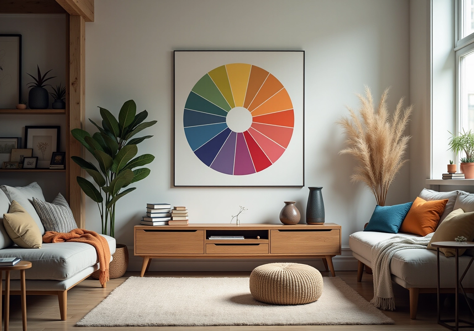
Hue theory is essential for understanding color, mix, and contrast, which plays a crucial role in the use of colour in art to create visual impact. The color wheel serves as a helpful visual guide, categorizing shades into primary, secondary, and tertiary tones. Have you ever noticed how complementary colors—those opposite each other on the wheel—can create striking contrasts that draw attention? Conversely, analogous shades, found next to one another, can create harmony and cohesion in your environment.
The psychology of color is another vital aspect to consider. For instance, blue can evoke tranquility and calmness, making it an ideal choice for bedrooms or relaxation areas. In contrast, red can evoke energy and passion, perfect for spaces designed for social interaction or creativity. Artists like Wassily Kandinsky have noted that “color is the keyboard of the visual arts,” underscoring its profound effect on our emotions and perceptions.
Incorporating these principles into your artwork and home decor choices can lead to more informed and intentional decisions. By grasping the interaction of colors, you can create environments in your home that not only look stunning but also feel welcoming and reflective of your individual style. Moreover, research indicates that 84.7% of individuals claim that hue is the main reason they buy a specific product, emphasizing the significance of hue in your design choices. By familiarizing yourself with these concepts, you can enhance the emotional atmosphere of your home.
Choose a Color Palette That Reflects Your Style
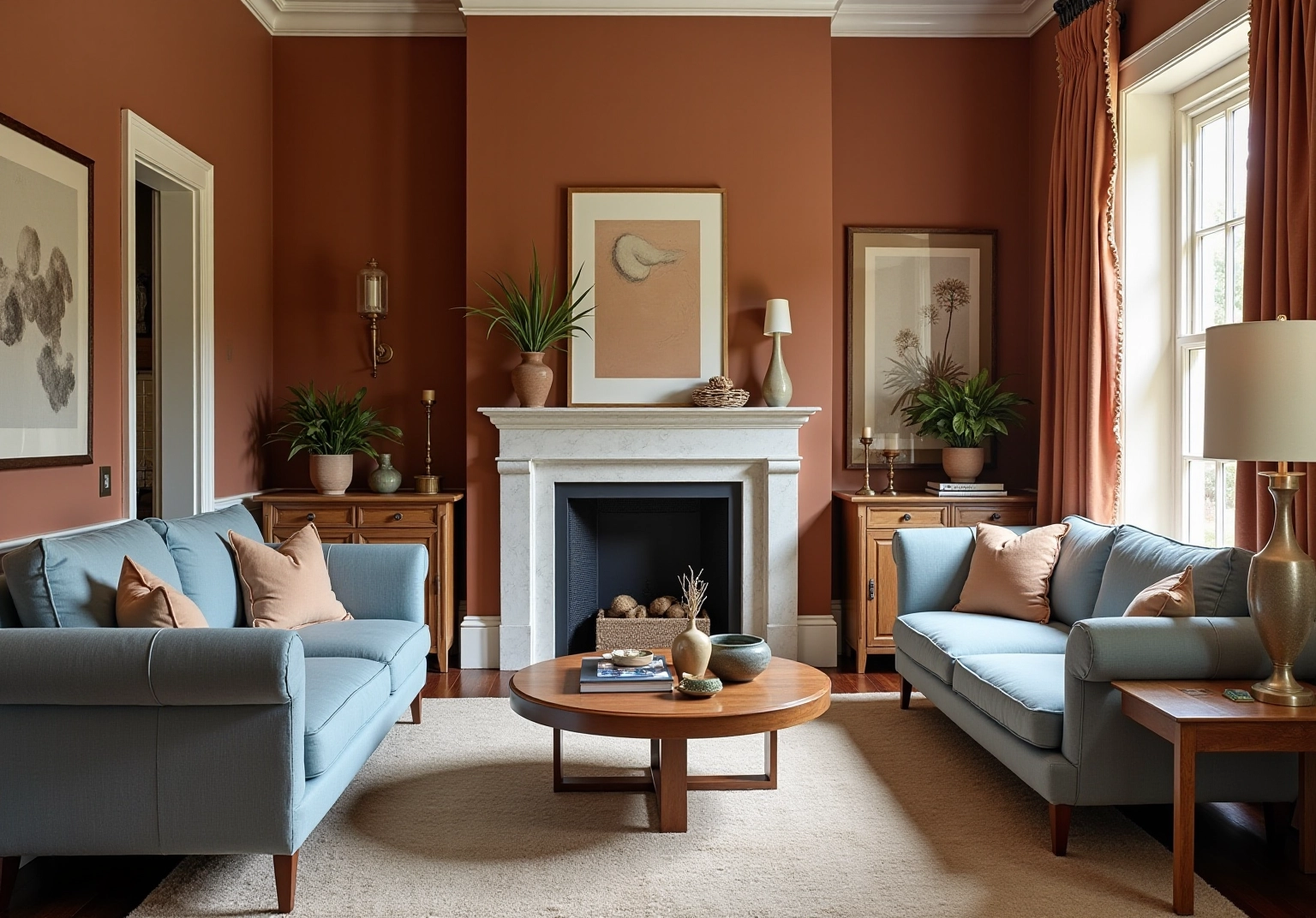
To create a palette that truly reflects your style, begin by identifying shades that resonate with you. Have you ever found inspiration in the colors, your favorite artworks, fabrics, or the beauty of nature? A highly effective strategy to consider is the 60-30-10 rule: allocate 60% to a dominant hue, such as wall paint, 30% to a secondary shade like upholstery, and 10% to an accent tone represented by accessories. This method not only ensures balance but also enhances your space. Moreover, think about contrast alongside your hue selections to avoid a monotonous look.
As you explore your choices, consider the color trends, showcasing rich, inviting tones like earthy shades and hues such as Truffle and dusty blue that evoke warmth and sophistication. Testing colors in your home is essential; take note of how various hues interact with your lighting during the day before finalizing your selections. Remember, 80% of real estate professionals believe that painting positively impacts a property’s value, making your hue choices all the more significant.
Tips for Choosing a Palette:
- Inspiration Sources: Look at art, nature, or textiles for ideas.
- 60-30-10 Rule: A principle for allocating hues in an area, which can be modified to suit your individual style.
- Test Samples: Always test hues in your space to see how they appear in various lighting during the day.
- Incorporate Textures: Use varied textures and tones to enhance depth.
Apply Color Strategically in Different Spaces
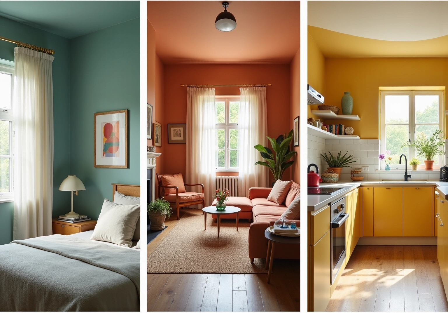
When introducing color in different areas, it’s essential to consider both the purpose and the atmosphere. Have you ever experienced how color in art can transform a space? For instance, blues are perfect for bedrooms, fostering relaxation and tranquility. In fact, 42% of people prefer blue, associating its color in art with calmness. On the other hand, reds, as examples of color in art, can invigorate a kitchen or living area, stimulating energy and creativity. Brighter hues can make compact areas feel more spacious and airy, while deeper tones contribute to a warm, personal ambiance. Moreover, understanding the effect of lighting is crucial in the context of color in art; natural light enhances colors, while artificial illumination can alter their appearance.
To establish a cohesive appearance, focus on how hues transition from one room to the next. A harmonious palette of color in art throughout your home enhances visual flow.
- Living Areas: Warm tones, such as terracotta or soft beige, create an inviting atmosphere, perfect for social gatherings.
- Bedrooms: Soothing hues like pale blue or soft lavender encourage restful sleep and relaxation.
- Kitchens: Colors such as sunny yellow or crisp white can stimulate energy and creativity, making cooking a joyful experience.
- Flow Between Rooms: Ensure that tones transition smoothly to maintain harmony, using similar shades or complementary hues to connect spaces effectively.
As Paul Gauguin noted, ‘Color in art!’ What a deep and mysterious language it is, the language of dreams that uses color in art. This beautifully emphasizes the importance of color to your living space.
Experiment with Color Combinations and Personal Touches
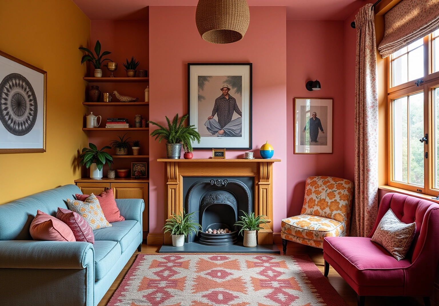
Experimenting with colour in art through techniques can yield stunning results in home decor. Have you ever felt the urge to transform your space? Start by blending different tones of a single hue to generate depth and dimension. Alternatively, combining complementary colors can make a bold statement that captures attention and breathes life into your home. Patterns and textures are crucial; they enhance visual appeal and intricacy, adding interest. For instance, incorporating murals or wallpapers can significantly elevate the aesthetic appeal.
Personal touches, such as artwork or handmade items, further enrich the overall design, making the space feel more inviting and reflective of your individual style. Remember, there are no strict rules in hue application—trust your instincts and enjoy the process. As many artists suggest, the use of colour in art can be a powerful medium for expression, allowing you to convey emotions and create a harmonious atmosphere in your home.
Tips for Experimentation:
- Mix Shades: Combine different shades of the same color for added depth.
- Use Patterns: Incorporate textures to introduce variety.
- Trust Your Instincts: Follow your intuition regarding color choices; creativity often flourishes through instinctive choices.
Conclusion
Understanding and utilizing color effectively in art can truly enhance the ambiance of your home. Have you ever felt that something was missing in your space? By mastering color theory, selecting a personal palette, applying colors thoughtfully across different areas, and experimenting with combinations, you can transform your environment into a stunning reflection of your unique tastes and emotions.
It’s essential to grasp color theory, as it not only helps in creating visually appealing spaces but also influences the emotional atmosphere within your home. Consider the significance of:
- Complementary colors
- Analogous colors
- The 60-30-10 rule for palette selection
- Strategic application of colors based on the function of each room
Moreover, adding personal touches and experimenting with textures and patterns can further enrich your overall aesthetic.
Ultimately, the power of color in art and design is profound. It serves as a remarkable tool for self-expression and can significantly impact how you experience your living spaces. Embrace the journey of color exploration, and let your creativity shine through. Craft an environment that is both inviting and reflective of your personal style.
Frequently Asked Questions
What is hue theory and why is it important in art?
Hue theory is essential for understanding how shades interact, mix, and contrast, which plays a crucial role in using color in art to create inviting spaces in your home.
What is the hue wheel and how does it categorize colors?
The hue wheel is a visual guide that categorizes shades into primary, secondary, and tertiary tones, helping artists and designers understand color relationships.
What are complementary hues and how do they affect art?
Complementary hues are colors that are opposite each other on the hue wheel; they create striking contrasts that draw attention in artwork and design.
What are analogous shades and what effect do they have?
Analogous shades are colors found next to one another on the hue wheel; they foster a sense of harmony and cohesion in an environment.
How does color impact emotions in art?
Different colors evoke different emotions; for example, blue is associated with tranquility and calmness, while red evokes energy and passion.
What did Wassily Kandinsky say about color?
Wassily Kandinsky noted that ‘Color is a power which directly influences the soul,’ highlighting the profound effect of color on emotions and perceptions.
How can understanding color theory improve home decor choices?
By grasping the interaction of hues and their emotional impact, individuals can make more informed and impactful design decisions that reflect their style and create welcoming environments.
What percentage of individuals consider hue as the main reason for purchasing a product?
Research indicates that 84.7% of individuals claim that hue is the main reason they buy a specific product, emphasizing its significance in design choices.
List of Sources
- Understand Color Theory and Its Impact on Art
- Inspirational Color Quotes By The Masters – Draw Paint Academy (https://drawpaintacademy.com/inspirational-color-quotes)
- 30 Quotes That Will Convince You To Start Using More Color (https://housebeautiful.com/room-decorating/colors/g15954761/color-quotes)
- 60 Great Quotes On Color – John Paul Caponigro (https://johnpaulcaponigro.com/blog/16588/60-great-quotes-on-color)
- 70+ Color Psychology Statistics & Facts (2026 Data) – Colorlib (https://colorlib.com/wp/color-psychology-facts)
- sensationalcolor.com (https://sensationalcolor.com/color-quotes)
- Choose a Color Palette That Reflects Your Style
- elledecor.com (https://elledecor.com/design-decorate/trends/a62804681/color-trends-2025)
- The Secret Trick Designers Use to Coordinate Any Room (https://housebeautiful.com/design-inspiration/a61145430/color-rule-60-30-10-explained)
- elephantstock.com (https://elephantstock.com/blogs/inspiration/choosing-a-color-scheme-60-30-10-rule?srsltid=AfmBOopBp4ST29D-yaMPWUU0C4mDVNnkOtKOG4tIpSon7S9H4S4vzzAs)
- vanderkolkpainting.com (https://vanderkolkpainting.com/2023-house-painting-statistics-trends)
- stylebyemilyhenderson.com (https://stylebyemilyhenderson.com/design-mistakes-how-to-find-and-execute-your-perfect-color-palette)
- Apply Color Strategically in Different Spaces
- 70+ Color Psychology Statistics & Facts (2026 Data) – Colorlib (https://colorlib.com/wp/color-psychology-facts)
- blocc.co.uk (https://blocc.co.uk/colour-psychology-in-interior-design-how-colour-affects-our-mood-behaviour)
- sensationalcolor.com (https://sensationalcolor.com/color-quotes)
- worldcoppersmith.com (https://worldcoppersmith.com/articles/50-inspiring-interior-design-quotes-from-famous-designers?srsltid=AfmBOooWIM1IYF0Gz_YVsFWsf_iQlzWWoKSmR6yWbaGHgSljArN_hFRN)
- Experiment with Color Combinations and Personal Touches
- 20 Interesting Interior Design Facts and Statistics in 2023 | Foyr (https://foyr.com/learn/interior-design-facts-and-statistics)
- sensationalcolor.com (https://sensationalcolor.com/color-quotes)
- fixr.com (https://fixr.com/articles/paint-color-trends-2024)


comments +